Implement Dark Mode On Your React Application
2/15/2026
Motivation
In this article you'll learn how to implement Dark Mode on your webpage.
We'll be building a simple page with some custom Dark theme.
We'll use:
- A theme toggle component — UI to switch between light/dark.
- Class-based theme switching — toggling a dark class on .
- CSS Custom Properties (CSS Variables) — the actual color values.
You only need to have some familiarity with:
- Javascript
- React
- CSS
Preparation
Let's first create a simple React application and build on top of it.
npm create vite@latest my-react-app -- --template react-tsChoose the default options and run the app with:
npm run devThe toggle
Let's create a toggle. Create the file ./src/ThemeToggle.tsx and fill it with
a simple toggle component implementation.
The purpose of this component is to add or remove the dark class from the
html element when toggled. It also remembers the user's preference using
local storage.
<html class="dark">So our src/ThemeToggle.tsx would look like this:
// src/ThemeToggle.tsx
"use client"

import { useEffect, useState } from "react"

export default function ThemeToggle() {
  const [dark, setDark] = useState(() =>
    typeof window !== "undefined"
      ? localStorage.getItem("theme") !== "light"
      : true
  )

  useEffect(() => {
    document.documentElement.classList.toggle("dark", dark)
    localStorage.setItem("theme", dark ? "dark" : "light")
  }, [dark])

  return (
    <button
      onClick={() => setDark(d => !d)}
      aria-label="Toggle dark mode"
    >
      {dark ? "🌞" : "🌙"}
    </button>
  )
}
Now, let's edit your src/App.tsx and add the ThemeToggle component:
Don't get distracted by what's inside the main tag—the important part is
the toggle we added in the header.
<header className="flex justify-end p-4">
  <ThemeToggle />
</header>
The rest of the elements inside main are there to provide an example of how
they look when changing from light mode to dark mode.
// src/App.tsx
import "./App.css"
import ThemeToggle from "./ThemeToggle"

function App() {
  return (
    <div className="app-container">
      <header className="flex justify-end p-4">
        <ThemeToggle />
      </header>

      <main>
        <section className="prose">
          <h1 className="text-primary">Dark Mode Demo</h1>

          <p className="text-secondary">
            This is a simple page to demonstrate how
            <strong>typography</strong>, links, and UI elements
            look in a <strong>dark theme</strong>.
          </p>

          <p className="muted text-tertiary">
            The lines below show semantic tokens in use:
            primary/secondary/tertiary text, a panel using
            `--color-white`, an accent button, and a tag.
          </p>

          <a
            href="https://react.dev"
            target="_blank"
            rel="noreferrer"
            className="accent-link"
          >
            Visit the React documentation
          </a>

          <div className="panel">
            <p>
              This panel uses <strong>`--color-white`</strong> as its background
              so it adapts between light and dark (it becomes `--dark-panel` in
              dark mode).
              <span className="tag">Example Tag</span>
            </p>
            <div style={{marginTop: '0.5rem'}}>
              <button className="accent-btn">Accent Button</button>
            </div>
          </div>
        </section>
      </main>
    </div>
  )
}

export default App
After the changes you can visit http://localhost:5173/ and you should see
this:
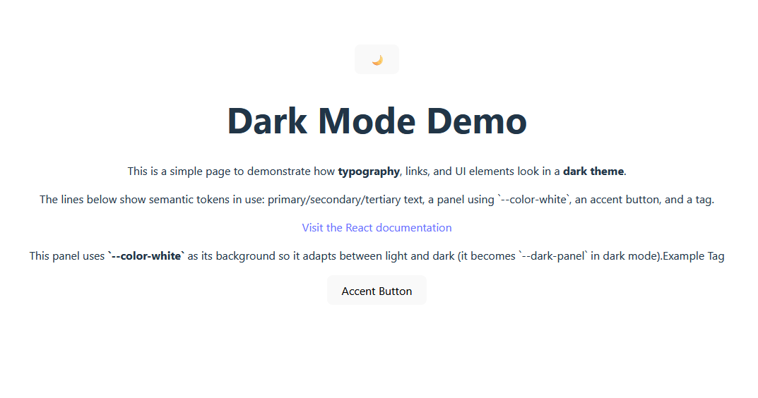
Progress! Now let's start customizing our solution.
CSS theme
This is the core part of our solution, so we need to understand a few things before we just drop the full code. Please bear with me :)
What are CSS Custom properties?
Property names that are prefixed with
--, like--example-name, represent custom properties that contain a value that can be used in other declarations using the var() function. Mozila docs
You could use these variables like this:
- First, we define the variable. The best place to define it depends
on where in the project it will be used. For our purposes (dark theme
implementation), it makes sense to place it in the
:rootpseudo-class. - Then use them in the other elements with the
var()function.
:root {
  --my-color: #1166ff;
}

#paragraph {
  background-color: var(--my-color);
}<p id="paragraph">
Hello, world!
</p>Now that we cover the basics, we can check on how to leverage CSS custom properties for our purposes.
What are Semantic Color Tokens?
Before we write some CSS for our app, we need to understand what semantic color tokens are.
Semantic Tokens are CSS variables that describe a purpose rather than the actual value. For example:
- Bad:
--dark-gray-800 - Good:
--text-primary
The first describes a literal value (wrong), the second describes that its purpose is to be used for primary text (good).
How we use this for a dark theme?
Keep in mind that our toggle component will add and remove the dark
class on <html>. With that in mind, this code should be the "aha!" moment where
everything clicks.
:root {
  /* Light mode */
  --text-primary: #171717;
  --text-secondary: #666666;
  --background: #ffffff;
}

html.dark {
  /* Dark mode - automatically applied when <html class="dark"> */
  --text-primary: rgba(255, 255, 255, 0.9);
  --text-secondary: rgba(255, 255, 255, 0.75);
  --background: #0b0f14;
}
And there you go. When our toggle adds the dark class to the <html> element,
the CSS will automatically recognize it and override the light mode variables
we defined in the :root selector. This causes all elements using those variables
to change, thus implementing the dark mode colors.
Our full implementation
Now that we understand how things work, let's make some changes to our
src/index.css.
:root {
  /* base variables from default template */
  font-family: system-ui, Avenir, Helvetica, Arial, sans-serif;
  line-height: 1.5;
  font-weight: 400;

  color-scheme: light dark;
  color: rgba(255, 255, 255, 0.87);
  background-color: #242424;

  font-synthesis: none;
  text-rendering: optimizeLegibility;
  -webkit-font-smoothing: antialiased;
  -moz-osx-font-smoothing: grayscale;

  /* Light mode */
  --background: #ffffff;
  --foreground: #171717;
  --color-white: #ffffff;
  --text-primary: #171717;
  --text-secondary: #666666;
  --text-tertiary: #999999;
  --prose-text: var(--text-primary);
  --accent: #16a88f ;
  --tag-bg: #e6fff9;
  --tag-text: #16a88f;

  /* Dark mode colors from dark-mode.html */
  --dark-bg: #181a1b;
  --dark-panel: #0f1621;
  --dark-text: #e6edf3;
  --dark-muted: #9aa4b2;
  --dark-accent: #27d3c3;
  --dark-accent-soft: rgba(39, 211, 195, 0.35);
  --dark-bar-bg: #1c2533;
  --dark-border: #182235;

  /* Font variables */
  --font-inter: "Inter", sans-serif;
  --font-mono: "JetBrains Mono", monospace;
}


/* Dark mode - automatically applied when <html class="dark"> */
html.dark {
  --background: var(--dark-bg);
  --foreground: var(--dark-text);
  --color-white: var(--dark-panel);
  --text-primary: var(--dark-text-primary);
  --text-secondary: var(--dark-text-secondary);
  --text-tertiary: var(--dark-text-tertiary);
  --prose-text: var(--dark-prose);
  --accent: var(--dark-accent);
  --tag-bg: var(--dark-bar-bg);
  --tag-text: var(--dark-accent);
}

html, body, #root {
  height: 100%;
}

body {
  margin: 0;
}
Now you can see that we've defined the dark variable values in the :root
selector. This way, we keep everything well organized in a single place.
The purpose: those --dark-* tokens are the source values that
html.dark { ... } references (e.g., --background: var(--dark-bg)). This provides
a single place for dark-theme colors.
Let's add some more detail, shall we?
We'll use these variables in our src/App.css file.
src/App.css
#root {
min-height: 100%;
margin: 0;
display: flex;
flex-direction: column;
align-items: stretch;
}
.app-container {
background: var(--background);
color: var(--foreground);
padding: 40px;
min-height: 100%;
transition: background-color 200ms ease, color 200ms ease;
}
/* Token usage examples */
.prose {
color: var(--prose-text);
max-width: 60ch;
margin: 1rem auto;
line-height: 1.6;
}
.text-primary {
color: var(--text-primary);
}
.text-secondary {
color: var(--text-secondary);
}
.text-tertiary {
color: var(--text-tertiary);
font-size: 0.95rem;
}
.accent-link {
color: var(--accent);
font-weight: 600;
}
.panel {
background: var(--color-white);
border: 1px solid var(--dark-border);
padding: 1rem;
border-radius: 8px;
margin-top: 1rem;
}
.tag {
display: inline-block;
background: var(--tag-bg);
color: var(--tag-text);
padding: 0.2rem 0.5rem;
border-radius: 6px;
font-weight: 600;
margin-left: 0.5rem;
}
.accent-btn {
background: var(--accent);
color: var(--color-white);
border: none;
padding: 0.6rem 1rem;
border-radius: 8px;
cursor: pointer;
margin-left: 0.5rem;
}
.muted {
color: var(--text-secondary);
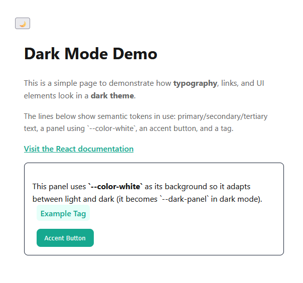
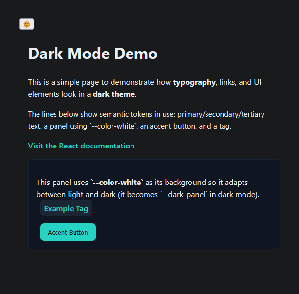
}The result
Light mode:
Dark mode:
Congratulations on getting this far and I wish you the best with your own implementation of a Dark theme in your page!
I hope you enjoyed this article and that it helped you understand how to leverage the power of CSS variables and semantic color tokens to implement a Dark Mode theme in a way that is clean and scalable.
References
If you liked this posts, please consider supporting me by buying me a coffee! :)